5 Color Correction Mistakes To Avoid in Photo Editing
Even (maybe especially!) when you're just doing a quick photo edit, correcting color is key to achieving a natural result.
Correcting color when editing might seem daunting when faced with at least 500 different options — ok, maybe not quite so many, especially when first starting out — but it doesn’t have to be.
As with most things in life, practice makes better, as does learning from those who have come before you.
Today we’re going to look a little deeper into Lightroom, as this is one of the most popular photo editing options available. There are some common color correction mistakes to avoid and best practices to follow, ensuring that your photos have just the right amount of pop without going too far.
Avoid these five classic editing mistakes and you'll be well on your way to perfectly edited photos with just the right balance of color.
Mistake #1: You think more is better.
The easy answer here is… it’s not. Usually.
Of course, if you’re an experienced editor, you might understand how to work with layer upon layer of edits. In many scenarios, though, especially when you’re new to editing, it’s best not to go overboard. Those over-the-top colors might look impressive at first because everything pops, and it feels new.
But when you look back in six months after gaining more experience, there’s a high likelihood that you’ll be cringing at those “pops” that look completely unrealistic. If you’re a human who has ever worn makeup, you might remember those first few times where you packed it on feeling awesome until you realized that less is more. Usually.
Mistake #2: You’re getting too hot or cold.
If you’re new to using Lightroom, or any other photo editing software for that matter, you may notice that the skin tones and colors either look a little too yellow/orange/red (warm) or blue/green (cool).
This is due to what's known as your white balance. Just a slight bump in the warmth of a photo can drastically change the final image.
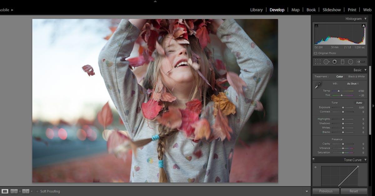
When adjusting the warmth of an image, you can use the relevant sliders in your Lightroom menu. Once you’ve adjusted the Temp, you can balance out any greens or magenta colors using the Tint option just below it.
It’s incredible how a small touch of warmth can transform a photo taken in natural light, or how adding some coolness can save an image blown out with orange from traditional light bulbs.

Before: an unedited image with fairly dull colors. Scroll on to see how we can improve this.
Mistake #3: You didn’t realize the Tone Curve Panel is awesome.
The Tone Curve Panel can be a little tricky when you’re new to it — and even when you’re not.
Let’s call it the TCP. The TCP represents all of the tones in your image. The graph’s bottom left shows the shadows, center the mid-tones, and the far, upper right, the highlights. When using the TCP, you just click on the line where you want to adjust the colors. If you’re going to make the mid-tones darker, you’ll click around that area and slowly drag it down towards the “Darks” until you reach the desired effect.
It takes some playing with, but ultimately the Tone Curve Panel is a powerful tool that you won’t want to neglect.
Mistake #4: You underestimate the basics.
You know, small adjustments to exposure/contrast, highlight/shadows, hue, saturation, blacks/whites. These editing basics are straightforward and make a significant impact on photos, especially ones taken right out of the camera or off your phone with little calibration before the image was taken.
Depending on your camera, you could darken the “blacks” in your image to give your photo a richer, more velvety look like in our sample edits here. You can increase the saturation to make colors pop — don’t go overboard!
You can up the exposure if it was too dark. And you can increase the contrast. Many of these adjustments are also impacted by utilizing the Tone Curve Panel to darken or lighten certain parts of the color. However, the TCP allows you to target specific ranges of colors.
When doing a quick edit, focusing on the colors in the image is an easy way to ensure a realistic edit that preserves the authenticity of the shot while still visibly improving the final result.

After: a vibrant but still natural edit that brings out the colors of the fall leaves.
Mistake #5: You didn’t know batch editing was a thing.
You're welcome. If you’re a photographer who photographs portraits or weddings, batch editing is going to save your sanity.
Once upon a time, I edited entire weddings in Photoshop without realizing how to batch edit. As a newbie, I was struggling to make it through a set of 2,000 images, one photo at a time.
When I switched to Lightroom, the only reason was because of how easy it was to batch edit. If you don’t know about batch editing, now you do. Save years of your life by selecting multiple photos at once (go for ones that have similar dynamics), and editing them all at once.
In conclusion...
Color correction is vital for well-edited photos. Sure, you can take a bomb photo of a sunset or a person and think it’s the bee’s knees. But what if you could make it even better?
If you have an unedited photo that you just love, take that photo and do a little bit of editing to see if you can take it from awesome to jaw-dropping. If you're only going to do some minimal adjustments, editing for color is your best bet for leveling up most images.
Check out the photo above. When you look at the panel on the right in the first image, you’ll notice that all of the default settings are present. In the second image, you can see some of the adjustments made to bring out the vibrancy and color.
The best software for editing color
If you don’t have access to Adobe Lightroom, never fear. There are plenty — pleeenty — of other editing editing software options out there. Some of those include:
- Photoshop
- VSCO
- Snapseed
- Retouch
- PicsArt
- Facetune 2
- Lens Distortion
Some of these are paid applications, but many have some incredible features with the free versions.
No matter what app you use, you’ll want to make sure your screen is accurate, mainly when it comes to brightness and color accuracy. You’ll find presets already installed on many editing apps, including Lightroom, and you can purchase different presets as well.
While it’s good to know these common color editing mistakes to avoid and how to adjust these settings yourself, presets are a powerful tool worth investing in. You can find free presets throughout the internet, and it’s worth the investment to find a set of presets that align with your photo and editing styles. It’ll save you a lot of time in the long run!
Cover photo by Donatello Trisolino.
Pexels is a platform for high quality stock photos you can use for free.
Browse free photos


