The Photographer’s Guide to Understanding Composition
What's that magic photo ingredient that separates a pro photographer from a beginner? Composition.
One of the most important elements of a great photo, composition might also be one of the hardest to master. But there are some foundational ideas (and some easy tricks) all photographers can employ to start creating standout compositions—and we'll explain them all right here.
Much of today's ideas about what it takes to create a good composition come from an idea popularized by the renowned American landscape photographer Ansel Adams. Well-known for his painterly shots, Adams did a lot to help establish photography as a fine art form.
He used the term "visualization" to describe the particular process of really creating a picture, instead of just snapping a photo. As Marc Silber, an expert photography educator and writer, tells us, “Visualization means thinking through what it is exactly you want to capture. That’s the difference between a snapshot, where you just press the shutter of the camera and hope that it comes out, and a work of art."
The idea sound simple enough, but to put it into practice, it helps to get started with the basics of composition.
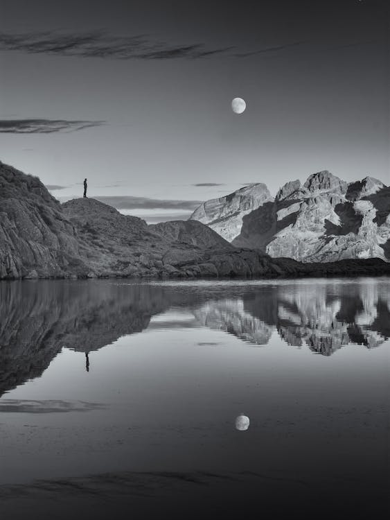
Two basic composition concepts—symmetry and the rule of thirds—combine to great effect in this perfectly composed photo by Gianluca Grisenti.
Photo by Gianluca Grisenti · View Photo
Composition, or the arrangement of subjects, shapes, and elements within the frame, is just as crucial to modern photographers as technical topics like exposure and focus, but it’s also more subjective. This guide will demonstrate all the basic principles of composition in photography that you can start using today for even better shots.
Finding balance
Symmetry and visual weight
What makes a beautiful composition stand apart from a forgettable one? Mastering composition means developing a good understanding of how to make use of visual weight or balance.
Perhaps the most obvious way to achieve a balanced composition is through symmetry, with each formal half of the frame reflected in the other. This can work well with photographs of reflections or architecture, where two similar halves form a balanced whole. You can also find this technique in portraiture, since the human face is symmetrical, or in minimalist photography, where you’ll often find graphic lines and shapes.
At the same time, many photographic compositions rely on what’s known as asymmetrical balance, where the two halves of the frame aren’t identical but still carry equal visual weight. Visual weight depends on many more factors than just symmetry: these include the placement, size, color, saturation, and brightness of the elements within your frame.

In this image, Jeffrey Czum balances the many small windows on the left with the few large windows on the right.
Photo by Jeffrey Czum · View Photo
For example, larger objects appear to “weigh” more than smaller ones; objects placed toward the edge of the frame seem “heavier” than those in the center. Objects with saturated colors and bright lighting also look heavier than those with muted colors and dark lighting. By arranging various elements of different sizes and colors within your frame, you can create a balanced composition, even if it isn’t symmetrical.

In this photo by Octoptimist, the figure in the foreground and her shadow draws much of our attention, but the red light in the distance creates a subtle counterpoint. Mysterious though it may be, this image maintains balance, and that’s part of what makes it compelling.
Photo by Ekaterina Astakhova · View Photo
The rule of thirds
One concept you’ll find in almost every introduction to composition is the rule of thirds, an idea that dates back to late 18th-century landscape painting. At that time, many compositions followed a different formula, with the main subject placed in the center of the canvas.
But the painter John Thomas Smith came up with a new theory: by placing the subject slightly off to the side, or on what’s known as the “thirds line,” artists could create a more unusual and dynamic composition.
It’s a principle that lends itself well to photography, and most of today’s digital cameras come with an optional grid overlay to help beginners learn to implement it. The rule of thirds grid will be familiar to many of you, as it resembles a tic-tac-toe board splitting your frame into nine equal parts, defined by two equally spaced vertical and horizontal lines. To follow the rule of thirds, you place your subject on one of those lines or their points of intersection.
In most cases, you’ll end up with an intriguing composition that’s balanced but not static. Many photos that follow the rule of thirds also follow the rule of asymmetrical balance. The rule of thirds also has a sister guideline known as the “golden ratio,” which can be visualized using either a grid or a Fibonacci spiral. It’s often not as noticeable as the rule of thirds, so it works well when you’re aiming for a more subtle effect.

In this photo by Anas Hinde, the lines of the Golden Gate bridge follow the golden ratio grid for a neatly lined-up composition.
Photo by Anas Hinde · View Photo
Guiding the eye
Leading lines
Leading lines are lines you use to draw the eye to your subject, or the most important part of your image. Many of these lines can be found in nature.
Ansel Adams used flowing river water, for instance, to pull attention towards mountains and monuments. Because leading lines can be found everywhere, they’re some of the most versatile tools you can use to direct your viewer’s attention throughout an image.

Here, Eberhard Grossgasteiger uses a winding road to draw our attention to the house in the distance.
Photo by eberhard grossgasteiger · View Photo
Leading lines can be horizontal, vertical, or perhaps most often, diagonal. They can be organic and curved or pin-straight. They can also be literal, as in the case of a river or road, or implied. The eyeline or gaze of a person in a portrait or street photo, for example, would be considered an implied leading line, as our eye will naturally follow theirs. If a line leads the eye to the horizon, rather than to a particular subject, it’s called a leading path.
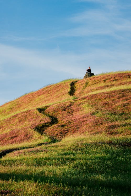
In this photo, Marco Trinidad uses a leading path to direct our attention toward the seated figure.
Photo by Marco Trinidad · View Photo
Depth
A keye element of the best landscape photography is often the layers of depth captured in the image: from trees or rocks in the foreground to low-hanging clouds to mountains in the distance. Photography is a two-dimensional medium, but you can incorporate layers like these to create the illusion of depth.

Alex Fu creates the illusion of depth using objects in the foreground, background, and middle-ground while framing this action shot in Coesfeld, Germany.
Photo by Alex Fu · View Photo
It can help to break up your photograph into three layers: your background, your foreground, and your middle-ground. Look for elements to occupy each of these three planes. Sometimes it’s as simple as bending down or moving just an inch or two in either direction. You can do this with landscapes, photos of people, and even still lives.
Another tool you can use to explore depth is depth of field, a trait determined by your lens’ focal length and aperture. A wide-open lens, for instance, can create depth by blurring the background of a portrait, while a lens with a closed aperture will work well for keeping all the details of a landscape in focus, from the closest blades of grass to the furthest mountaintops.
A frame within a frame

Levent Simsek uses a window view to create a frame within a frame.
Photo by Levent Simsek · View Photo
One popular technique for creating depth is using “a frame within a frame” or “sub-framing.” To use an example from photo history, you’ll find this technique often in the work of the street photographer Henri Cartier-Bresson, who used windows, stairways, broken walls, and even lines of trees to form a “frame” around the people in his images.
The idea here is to use lines and shapes to guide the eye toward your subject, while also adding interest and depth.
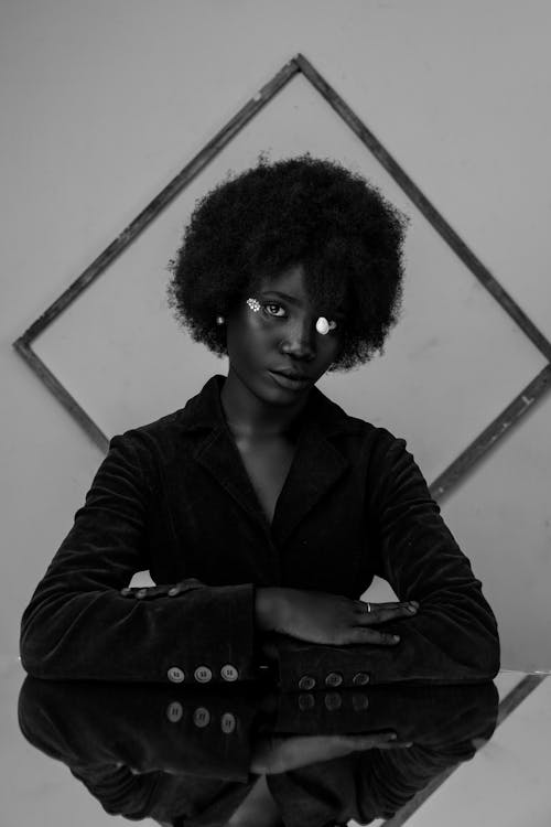
This portrait by uncoveredlens uses background framing to guide the eye toward the subject’s face.
Photo by Eze Joshua · View Photo

Another clever sub-framing technique: Airam Data-on uses shadow to frame the photo subject.
Photo by Airam Dato-on · View Photo
Many photographers will use the frame within a frame technique organically and instinctively, but it can help to enter a scene with this principle in mind.
Look for negative space surrounding your subject and then find ways to frame it, either with a building or natural elements like tree branches or even human figures. You can place your frame in the background of your subject or your foreground. Doorways and windows work well for a more literal take on the motif.

Maksim Goncharenok takes an unconventional approach to a frame within a frame.
Photo by Maksim Goncharenok · View Photo
Perfecting your angles
Filling the frame
One of the most common tips you’ll hear for beginner photographers is also one of the easiest to implement: get closer!
When they start out, many photographers prefer to shoot wide, but by moving in and zooming with your feet, you can effectively “fill the frame” with your subject for a compelling composition. Another way to approach it is by using a macro lens for smaller subjects like insects or flowers or for creating abstract close-ups that highlight shapes, colors, and textures.
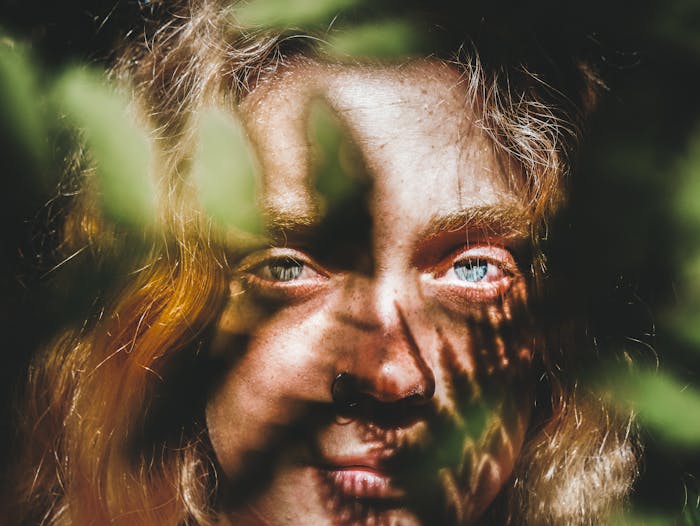
The subject's face fills the frame in this shot by Max Ravier. The leaves add texture and an element of interest to keep the portrait unique.
Photo by Max Ravier · View Photo
Filling the frame is all about focusing in on your subject and eliminating distractions. This technique can work especially well with a cluttered background: for example, a clear sky with troubling power lines.
When filling the frame, stay mindful of the most important features of your image, and keep an eye on the edges of your image. If what's contained in the edges of the frame doesn't add anything to your composition, it's time to take a step (or zoom) closer.
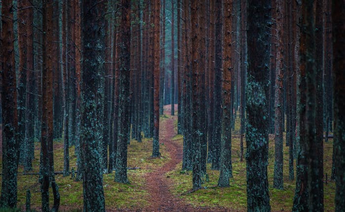
Egor Kamelev finds symmetry in the natural world.
Photo by Egor Kamelev · View Photo
Image orientation
Composition often boils down to moving around, crouching down, looking up, and adjusting your angles. One of the most significant composition choices you can make is whether you’re shooting horizontally or vertically.
Landscape photographs are usually horizontal because they lend themselves to those kinds of compositions, while portraits tend to be vertical, but feel free to experiment based on your subject and vision. It can help to shoot in both landscape and portrait orientations for variety. That way, when you get home, you’ll have different compositions to choose from.
While most of your decisions will be made in-camera, you can always finesse your compositions during post-production. Most editing software comes with composition grids, overlays, and guides, including templates for the golden ratio and the rule of thirds. You can follow these when cropping your photos for publication on social media or print, while tailoring your crops to specific platforms like Instagram or Pinterest.

Thiago Matos riffs on the concept of symmetry in this creative portrait.
Photo by Thiago Matos · View Photo
It's good to remember that composition is subjective: these are just tools to help you learn to visualize your images before you take them and perfect them once you’re done.
“I don’t believe there are any rules,” says Silber, who wrote a book on composition. “For example, the ‘rule’ of thirds isn’t a rule at all, and there are so many great photographs that don’t follow it. These are all guidelines. Sometimes they work, and sometimes they don’t. The more you work with them, the better your judgment will be.”
Cover photo by Kamil.
Pexels is a platform for high quality stock photos you can use for free.
Browse free photos


